You Have 10,000 Metrics and You Still Don't Know If Your Cluster Is Healthy
You have Prometheus. You have Grafana. You have a dashboard called "Cluster Overview" with 63 panels, a legend in eight colors, and a refresh interval of 30 seconds that nobody has changed since the person who set it up left the company. You have recording rules someone wrote in 2023 that still run on every evaluation cycle but haven't been opened since. You have a Slack channel called #alerts that 17 people have muted, including three people whose job title contains the word "reliability," and one person who muted it so long ago they forgot it exists and will rediscover it during the next major incident at the exact wrong moment.
You have alert rules that fire at 3am for CPU spikes that resolve on their own. This is how you know they are not real alerts, but rather strongly-worded suggestions your team has collectively and silently agreed to ignore. The PagerDuty integration is technically working. Whether it's doing anything useful is a different question.
What you do not have is a reliable answer to the question someone will ask during your next incident: "Is the cluster healthy?"
This is not a tooling problem. Prometheus is excellent. Grafana is excellent. kube-state-metrics is doing exactly what it's supposed to do. The problem is that somewhere between "install the monitoring stack" and "understand what's happening in production," the goal shifted from understanding to collecting, and nobody stopped to notice.
The Data Hoarding Problem
The instinct to collect everything is understandable, and Prometheus makes it very easy to indulge. kube-state-metrics exposes around 200 metrics about your cluster resources out of the box. node-exporter adds a few hundred more from the OS layer. Every operator and tool you install ships its own ServiceMonitor and politely asks Prometheus to scrape a dozen more metrics, as if they are guests arriving at a party and each one brought a casserole nobody asked for. After six months of this, you have 10,000 unique metric names and a cardinality count that would make a database engineer wince.
None of this is the metric collection's fault. You asked for it, and it delivered. Good boy, Prometheus.
The problem is that metric collection is not observability. Metric collection is data hoarding with a retention policy. Observability is being able to ask arbitrary questions about your system's behavior and get useful answers quickly - ideally before the incident ends, not after. Those are related ideas but they are not the same idea, and confusing them is why teams end up with dashboards nobody opens during the exact incidents those dashboards were built to help with.
More data creates the feeling of understanding without the substance of it. It also creates the very specific feeling, during an incident, of opening Grafana, staring at sixty-three panels, seeing that fifty-one of them are green, and having absolutely no idea whether the cluster is okay. The other twelve are yellow. What does yellow mean? Good question. Nobody documented it.
First: Define What "Healthy" Actually Means
Most teams do not have an explicit definition of cluster health. They have dashboards. These are different things.
A dashboard showing mostly green means the things the dashboard measures are within the thresholds someone configured - probably during initial setup, probably against a cluster under no real load, by someone who is no longer at the company and cannot be reached to explain what they were thinking. It does not mean the cluster is healthy.
Write down a definition. Force yourself to be specific. Something like:
- API server is serving requests below 1% error rate and p99 latency under 500ms
- etcd write latency is below 100ms, DB size is below 6GB, no leader elections in the past hour
- Node capacity has at least 20% allocatable headroom on CPU and memory across the fleet
- Workload health: no Deployment running below desired replica count, no pods stuck in Pending for more than 3 minutes
- Node conditions: zero nodes in DiskPressure, MemoryPressure, or PIDPressure
That's five categories. Each has one or two signals. That's your cluster health definition. Everything else is debugging support material that belongs on a different dashboard nobody will open under pressure either.
This exercise is valuable beyond the list itself. Writing it down forces you to confront which metrics you're actually confident in, which ones you'd have to Google the query for, and - most usefully - which signals you realize you aren't collecting at all. "Pending pods older than 3 minutes" is a thing teams frequently have no clean alert on, despite it being the most obvious leading indicator that scheduling is stuck.
The Four Dashboards You Actually Need
Not sixty-three. Four.
Cluster capacity. Are you about to run out of room to schedule workloads? The key signal is allocatable versus requested, not actual utilization. Kubernetes scheduling decisions are made against resource requests, not real usage. A node can be sitting at 30% actual CPU while being 95% requested - from the scheduler's perspective, it's nearly full. Track kube_node_status_allocatable against the sum of pod resource requests per node. If you're looking at actual utilization here instead of requests, you're watching the wrong thing and the scheduler will teach you this lesson in production.
Workload health. Are your deployments at desired replica count? Are pods restarting? Pod restart rate is the canary-in-the-coalmine for almost every application-layer problem. A pod crash-looping at once per hour shows up on your restart-rate dashboard well before your error rate budges - if someone is watching. kube_pod_container_status_restarts_total grouped by deployment is more useful for most workload health questions than CPU utilization, which is a number that sounds meaningful and usually isn't.
API server health. Request error rate and p99 latency, broken down by verb and resource. When the API server is struggling, every controller, every operator, every webhook, and every kubectl command starts failing. It's the control plane's single throat to choke. Watching it costs almost nothing; finding out it was degraded by working backwards from "why did the deployment stop rolling out two hours ago" costs considerably more.
Node pressure signals. Nodes reporting DiskPressure, MemoryPressure, or PIDPressure are early warnings, not late-stage curiosities. A node in DiskPressure will evict pods soon. These conditions live in kube_node_status_condition and should alert within minutes of appearing, not surface on a dashboard someone reviews during the weekly ops meeting.
Everything else - JVM heap metrics, application throughput counters, request latency by endpoint - belongs on a service-level dashboard owned by the relevant team. It is useful. It is not cluster health.
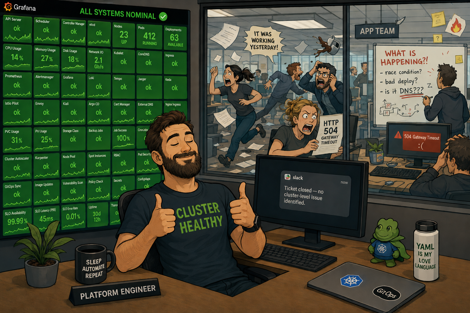
When the Cluster Looks Fine and the App Team Is on Fire
Here is the scenario you will definitely encounter if you haven't already: your cluster dashboard is green. The app team has a P1 incident open. They file a ticket. You open Grafana, confirm green, and close it: "No cluster-level issue identified." They escalate. Everyone gets on a call. Someone shares their screen. A senior engineer asks, almost as an aside, "is CoreDNS okay?" Nobody knows.
The CoreDNS CPU graph, which does not appear on the cluster overview dashboard, is a vertical line. CoreDNS has had two replicas since the cluster was provisioned in 2023. Your cluster now runs 340 services. Under load, pods are timing out on DNS resolution. The apps are broken. The cluster is technically healthy. Both things are simultaneously true. This is everyone's favorite kind of incident.
There is a whole category of Kubernetes-layer problems that present as application problems but are 100% platform team territory. They will not appear on your cluster health dashboard because they live in the gap between cluster infrastructure and application behavior. You need to instrument that gap.
CoreDNS latency and errors. Under-provisioned CoreDNS is probably the most common "the cluster is fine" incident there is. CoreDNS exposes its own metrics - coredns_dns_request_duration_seconds and coredns_dns_responses_total broken down by response code. A spike in SERVFAIL responses or p99 latency above 100ms is a platform problem that looks exactly like flaky app behavior to the team experiencing it. Add this to your cluster health definition. Scale CoreDNS with your cluster, not with your launch-day replica count.
Admission webhook latency. Every pod creation in your cluster passes through every mutating and validating admission webhook in series. If your Vault agent injector, your policy engine, or your service mesh webhook gets slow - after a certificate rotation, a config change, or just a bad day - pod startup latency climbs. Rolling deployments that used to take four minutes start taking twelve. The app team assumes it's their image size or their init containers. It's actually a webhook that added 800ms of latency to every pod creation. apiserver_admission_webhook_admission_duration_seconds will tell you this. Almost nobody has it on a dashboard.
NetworkPolicy silent drops. A NetworkPolicy that blocks traffic produces no log line, no error message, and no metric increment anywhere obvious. The connection just stops happening. The app sees a timeout. The platform team sees nothing. The only way to catch this proactively is either network-level flow logging (Cilium's Hubble is excellent for this) or having enough confidence in your NetworkPolicy change process to rule it out quickly. "Did anyone touch a NetworkPolicy in the last two hours" is a question that should be in your incident runbook.
OOMKills that don't look like OOMKills. When a container is OOMKilled, it may or may not increment the restart counter depending on restart policy and timing. What reliably captures it is kube_pod_container_status_last_terminated_reason. If that label shows OOMKilled, a container was terminated by the Linux OOM killer - not by a crash, not by a health check, by the kernel deciding it needed the memory more than your app did. This shows up as "the service occasionally returns errors" and "we can't reproduce it locally" and "it's probably a race condition in the code" until someone checks this metric and finds out it's been OOMKilled four times today.
CPU throttling. A container that hits its CPU limit gets throttled - not OOMKilled, not restarted, just slowed down. The pod looks Running. The deployment looks healthy. The node has available CPU. The container is being throttled because its limit is too low, and it's running slower than it should. container_cpu_cfs_throttled_seconds_total divided by container_cpu_cfs_periods_total gives you a throttle ratio. Above 25% and your container is meaningfully impacted. Above 50% and you have found your latency problem. This is frequently the explanation for "we're seeing elevated p99 latency and we don't know why" that takes a week to track down without the metric.
The practical addition to your cluster health definition: add DNS error rate, admission webhook p99 latency, and a check for OOMKilled containers in the last 15 minutes. These three signals alone will cut your "platform blamed the app, app blamed the platform, everyone was partially right" incident count significantly.
Alert on Symptoms, Not on Numbers
The canonical bad alert is CPUUtilization > 80% for 5m → page someone. This alert fires constantly, means nothing on its own, and trains your team to treat 3am pages as suggestions. You have built an on-call rotation full of people who have learned, through classical conditioning, to reach for their phone, squint at PagerDuty, and go back to sleep. The alert has successfully communicated something. It's just not sure what.
CPU utilization above 80% might mean your service is doing more work than usual, which is fine and good, that's what it's there for. Or it might mean there's a runaway process. The number alone can't distinguish between them, and paging someone to make that determination at 3am is not a great use of anyone's cognitive function.
Alert on things that tell you a user is already affected or the situation is about to get materially worse:
- Error rate above your SLO threshold - requests are failing right now
- API server error rate above 1% - the control plane is struggling; scheduling and rollouts are at risk
- Any node in a pressure state for more than 2 minutes - evictions are coming; act now or have the kubelet act for you
- Pending pods for more than 5 minutes - scheduling is stuck; usually capacity, a taint/toleration mismatch, or an admission webhook refusing everything
- etcd DB size approaching 6GB - the hard limit is 8GB and hitting it kills your control plane. This is one of the rare situations where a quiet dashboard guarantees a very loud incident.
- Deployment unavailable replicas for more than 10 minutes - something is stuck or crash-looping
- CoreDNS p99 latency above 100ms or error rate above 1% - DNS is quietly breaking things right now; the app team just doesn't know why yet
- Any container with OOMKilled terminations in the past 15 minutes - the kernel is making resource decisions on your behalf
Critical means "wake someone up because the system will materially worsen in the next 15 minutes if nobody acts." If your critical alerts resolve themselves without anyone doing anything, they are not critical. Downgrade them. Stop conditioning your team to file critical pages in the same mental category as email newsletters.
A reasonable hierarchy: most things land in #alerts as information, maybe 15% warrant a Slack ping to the on-call, and a small fraction actually require waking someone up. If your critical-page volume is high and your team is healthy and fully staffed, that's signal about your alert configuration, not your infrastructure.
The Cardinality Problem That Will Eventually Find You
You added pod, namespace, and container labels to your metrics because they seem useful. They are useful. They are also why your Prometheus storage is growing faster than you expected and why certain queries take 30 seconds to return when you need them in 30 milliseconds.
Pod names in Kubernetes are ephemeral. Every rollout creates new pod names - new label combinations - that Prometheus stores for your full retention period. High-cardinality label sets multiply your time series count exponentially. At scale, this eats storage, slows queries, and eventually crashes your Prometheus in a way that's deeply unpleasant to explain in a post-mortem, particularly the part where you have to describe what you were measuring.
Things that actually help:
Use deployment or service labels instead of pod where you can. You care about whether your payments service is healthy, not which specific pod handled request number 4,847,221.
Write recording rules for expensive queries. A recording rule pre-computes a query on every scrape interval and stores the result as a new metric. Instead of joining three large metric families at query time across 10,000 series, you query the pre-computed result. Dashboards load in milliseconds. Queries stop timing out. You stop dreading opening Grafana during an incident.
Run promtool tsdb analyze on your Prometheus data directory. It reports your highest-cardinality metrics by label set. The top of the list is almost always surprising, occasionally embarrassing, and once in a while contains a metric you didn't know you were collecting. Run this before the growth becomes a crisis.
If you're on hosted Prometheus - Grafana Cloud, Datadog, whatever - your bill will tell you when you've gone wrong before your on-call does. The invoice is an observability signal. Take it seriously.
SLOs: The Dashboard You Should Have Built First
Service Level Objectives invert the observability model in a way that's initially uncomfortable and then permanently correct.
Instead of monitoring infrastructure and hoping it correlates to user experience, you define what "good" looks like from the user's perspective - 99.9% of requests succeed, 95% complete in under 300ms - and track how fast you're burning through your error budget. When you burn budget at 10x the sustainable rate, you get paged. When you're not, you don't, regardless of what the CPU graphs look like. The CPU graphs stop being a source of 3am anxiety and start being a debugging tool you reach for after the SLO tells you something is actually wrong.
The infrastructure metrics become supporting evidence for explaining why an SLO is burning, not the primary signal for whether anything is wrong. This is the mental model shift that gets teams off the CPU-alert carousel.
The tooling exists and is not that hard: Prometheus has the raw data, and tools like Pyrra or Sloth handle the burn-rate math and generate the alert rules so you don't have to implement multi-window rate calculations by hand at 11pm while simultaneously trying to fix whatever broke. The hard part is not technical - it's getting your team to agree on what "good" actually means for each service. That turns out to be a product conversation disguised as an observability conversation, which means it will take longer than expected and involve at least one stakeholder who wasn't in the original meeting. Those meetings are still worth having.
Test Your Alerts Like You Test Your Code
Your alerts have never been tested in a controlled environment. Your runbook links haven't been validated since the day they were written. Your on-call rotation reflects the org chart from Q3 of last year. You will discover all of this during your next incident, in the wrong order, while under pressure, at whatever time of day your incidents prefer.
Treat alerting the same way you treat application code:
-
Fire the condition deliberately. Spin up a test namespace, create a deployment that crash-loops, and verify the restart-rate alert fires within the expected window. If you can't reproduce the alert condition in a controlled environment, your alert is untestable - which usually means it's also misconfigured.
-
Walk the runbook. Out loud, with someone else watching, while the condition is live. Every step. You will find dead links, steps that require permissions nobody on the on-call rotation has, vague instructions like "check the dashboard," and at least one place where the runbook assumes context that doesn't exist anywhere in writing.
-
Verify the notification chain. The alert fired - did the right person get the page? Confirm in PagerDuty or OpsGenie. The rotation that was configured two years ago and the people who are actually on-call today are frequently not the same list.
-
Check auto-resolve behavior. Fix the condition, wait for Prometheus to evaluate, confirm the alert resolves cleanly. An alert that fires, gets acked, and silently auto-resolves before anyone looks at it creates false confidence. An alert that never resolves after the condition is fixed is just noise with a badge.
This takes an afternoon once. It saves hours every time something real happens, which at current industry rates is often enough to make the afternoon worthwhile.
The Bottom Line
You do not need more metrics. You need a written definition of what "cluster healthy" means - including the application-facing signals that live in the gap between infrastructure and behavior - four dashboards that answer that question directly, alert rules that fire on real symptoms with runbooks that work, and SLOs that tell you when users are affected before the infrastructure metrics catch up.
The rest of what you've collected is useful for debugging after you know something is wrong. It's not understanding. There's a difference, and it shows up every time someone asks "is the cluster healthy?" and the most honest answer anyone can give is "the dashboard is mostly green."
The teams that can actually answer that question during an incident aren't the ones with the most panels. They're the ones who decided what "healthy" meant before they needed to know, built toward that definition deliberately, and crucially, included the signals that live at the boundary between their cluster and their users' experience.
Hope is not a monitoring strategy. The green dashboard is not a SLO. CoreDNS does not scale itself. Define what you're measuring, measure it deliberately, and build the thing that actually tells you something.
Related Pages
- Parent index: Blog
- Related: Kubernetes Autoscaling Is Not a Strategy
- Related: Multi-Cloud Kubernetes: The Honest Take
- Related: True HA in Kubernetes: Why Multi-Zone Alone Isn't Enough
- Newsletter: This Week in Kubernetes